Home assistant is very powerful – possessing a great deal of flexibility both in terms of what can be monitored and how the monitored state is displayed. Much of the display flexibility comes through a combination of the Jinja templating engine and custom components.
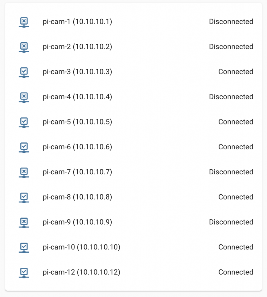
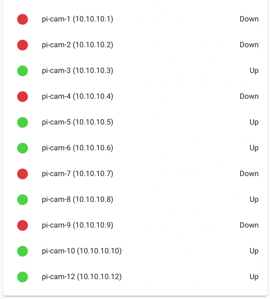
Here is one example of this flexibility in action: display a dynamic list of sensors, coloring the status LED differently depending on the sensor state. Or more specifically: the ping status for a set of devices – in this case the ping status of all my raspberry pi cameras.
To display a dynamic list of sensors I first helped myself by giving my devices a consistent name prefix – e.g. “pi-cam-X” where X is the instance. I then installed the wonderful auto-entities plugin and specified an inclusion filter of “/pi-cam/”
Next to perform the styling I download the template-entity-row plugin – which allows applying a template to each entity row. The card yaml is actually fairly compact and readable:
type: custom:auto-entities
card:
  type: entities
filter:
  include:
    - name: /pi-cam/
      options:
        style: |
          :host {
            --card-mod-icon-color: {{ 'rgb(221,54,58)' if is_state('this.entity_id','off')  else 'rgb(67,212,58)' }};
          }
        type: custom:template-entity-row
        icon: mdi:circle
        state: >-
          {% if is_state('this.entity_id','off') %} Down {% else  %} Up {% endif %}
To be honest it took way longer to accept that this kind of flexibility was not available out of the box – it is too bad some of these add-ons are not just core to HA as they seem like core functionality.
The “out of the box” display is on the left. The ostensibly-improved status is on the right. Note that in truth i dont see a huge need for displaying textually what the red/green LED shows, however I much prefer “Up/Down” to “Connected/Disconnected”..

